Scrib Ink Publishing
Welcome to Scrib Ink Publishing, a company dedicated to publishing insightful and engaging books.
Our Latest Release
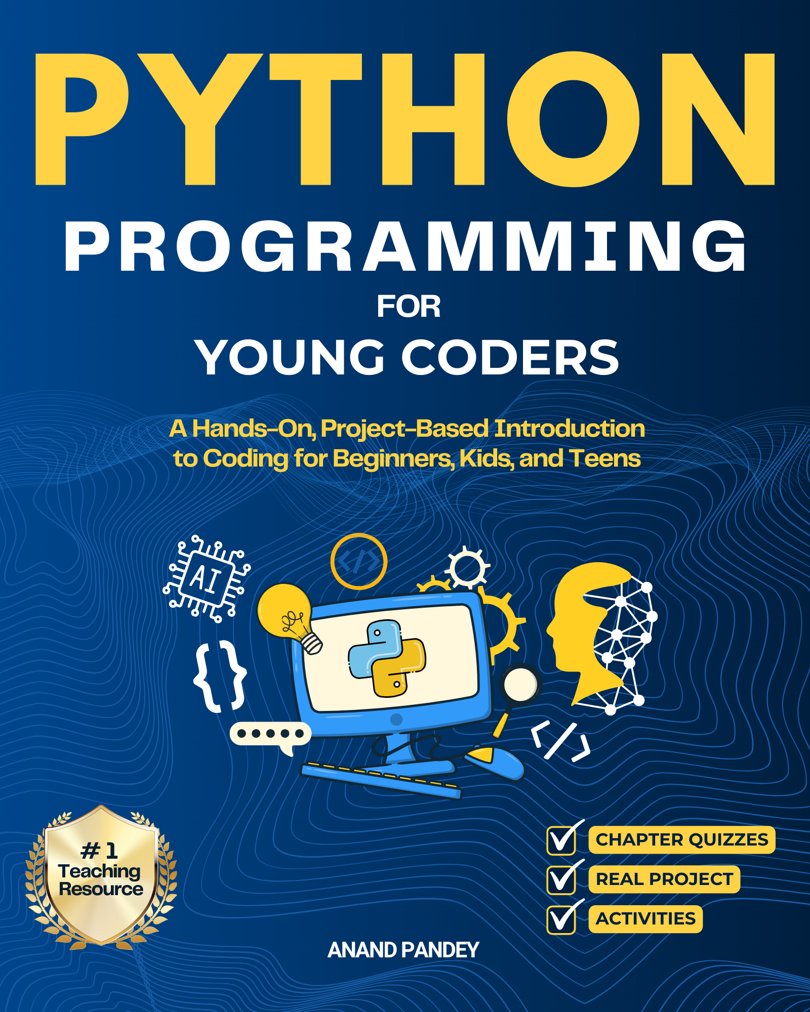
Python Programming for Young Coders
Errata
This section will be updated if the author finds any errors in the published book.